Strong research can lose impact when visuals are poorly designed. Data visualization is not just about aesthetics—it communicates insights, strengthens arguments, and builds trust. Yet, many researchers unintentionally weaken their findings by presenting flawed visuals.
In this article, we highlight the most common mistakes in research visualization, explain why they matter, and provide guidance on creating clear, credible visuals.
Why Good Visuals Matter in Research
Good data visuals clarify complex findings. They help audiences see patterns, relationships, and key takeaways quickly. Poor visuals, however, can confuse, mislead, or even misrepresent results. According to Evergreen (2019), visualization is as important as statistical analysis in communicating research truthfully.
Critical Mistakes Most Researchers Overlook
1. Chartjunk
Unnecessary 3D effects, shadows, and decorative elements distract from data. Tufte (1983) calls this “chartjunk”—design clutter that reduces comprehension.
- Use clean, flat charts with minimal extras.
2. Wrong Chart Type
Choosing the wrong chart confuses the audience. For example, pie charts fail at showing trends, and line charts distort categorical data.
- Match chart type to data structure (e.g., bars for categories, lines for trends).
3. Distorted Scales
Manipulating axes—such as truncating scales or using inconsistent intervals—can mislead readers. Research by Cleveland & McGill (1984) shows distorted scales change interpretation.
- Always use proportional scales and disclose axis breaks.
4. Overcrowding
Cramming too much into one figure reduces clarity. Multiple variables, colors, or overlapping elements overwhelm viewers.
- Break data into multiple charts, highlight only what supports the research story.
5. Lack of Context
Charts without clear labels, benchmarks, or units confuse readers. Without context, the audience cannot interpret meaning correctly.
- Add titles, axis labels, units, and explanatory notes.
Best Practices for Impactful Visuals
- Keep design simple and uncluttered.
- Use consistent colors and scales.
- Align chart choice with the research question.
- Add benchmarks and labels for context.
- Test visuals with peers for clarity.
Visual Example: Common Mistakes
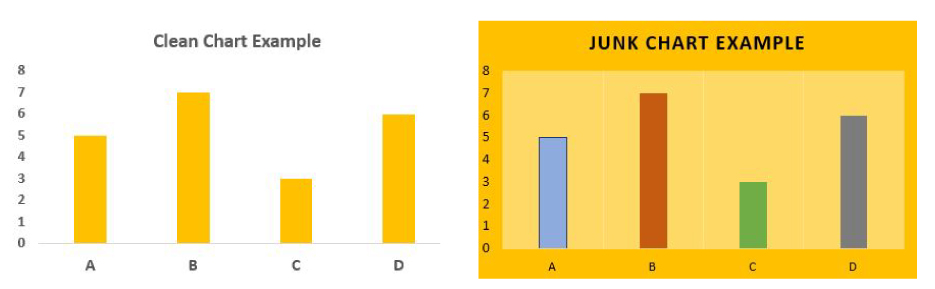
Figure 1: Chartjunk vs. Clean Chart (source: Datawrapper)
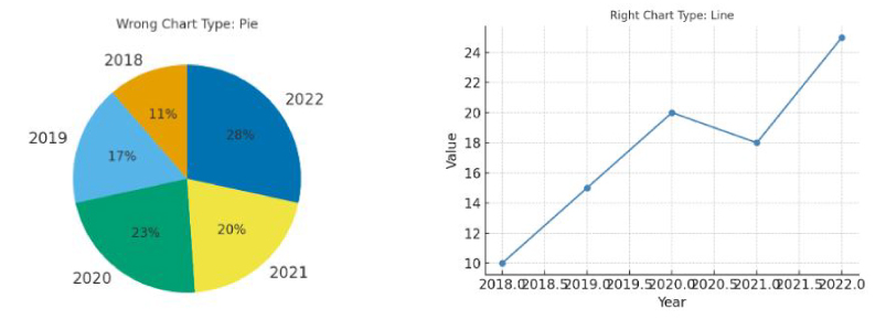
Figure 2: Wrong vs. Right Chart Type (source: FlowingData)
Why This Matters
Flawed data visualization does more than confuse—it undermines trust. In academic and professional contexts, misleading visuals can cause reputational damage and reduce policy or business impact. By applying best practices, researchers can ensure their findings are not only rigorous but also accessible and persuasive.
References
- Tufte, E. R. (1983). The Visual Display of Quantitative Information.
- Evergreen, S. (2019). Effective Data Visualization.
- Cleveland, W. S., & McGill, R. (1984). Graphical Perception. Journal of the American Statistical Association.
- Datawrapper Blog.
- FlowingData.
Final Thought
A strong study deserves strong visuals. Poor charts don’t just confuse—they undermine the trustworthiness of your entire research. By avoiding these common mistakes and designing with clarity, researchers can ensure that their visuals reinforce, rather than weaken, their arguments.
At Research & Report Consulting, we help scholars, NGOs, and institutions elevate their research communication through evidence-based visualization strategies. Because in research, clarity is credibility.